Author: | Geheeb, Julian; Huber, Dominik; Landvogt, Janosch |
|---|---|
| Supervisor: | Prof. Gudrun Klinker |
| Advisor: | Dyrda, Daniel (@ga67gub) |
| Submission Date: | 03.02.22 |
Abstract
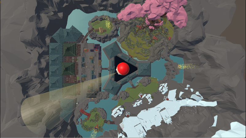
As part of the level engineering lab course, we have examined techniques of level engineering and applied them in a prototype game called "Daruma". Daruma is an asynchronous multiplayer game. The game was made with a focus on level design with the theme "taking cover". There is one seeker who can look at the whole map from above, but only through a small view cone. The seeker needs to find the runners, the other type of player. The runners explore the map, gather coins, take cover, and try to bring their coins to the seeker's castle in the middle of the map to save them permanently. Runners can additionally steal coins from other runners or expose their positions by launching fireworks at their location. In the end, the player with the most gained coins wins. It should be mentioned that the seeker gets his coins by clicking on a runner and stealing the coins currently carried by the discovered runner.
Resources
Trailer
Download & Play the Game
Slides of the Final Presentation
Pictures
Setup
General Aspects
Team Name: Daruma
Task Tracking: Google Sheets Timeline
Communication: Discord Server
Version Control: Git - LRZ GitLab
Documentation Tool: Google Sheets Game Design Document, Google Drive folder & this Wiki
Milestones:
21.10. - 04.11.: Setup, Game Concept
05.11. - 25.11.: Research, Paper Prototype, Gameplay Prototype
26.11. - 16.12.: Level Prototype
17.12. - 24.12.: Playtest I
25.12. - 13.01.: Level Prototype Iteration
14.01. - 03.02.: Playtest II
Team:
Julian Geheeb - Paper prototype, programming (game mechanics), level design (mountain, pillars), final polishing before Demoday and GGBavaria, feedback and help with level section of the other team members
Dominik Huber - Documentation, paper prototype, programming (UI), level design (lake, farm), trailer, feedback and help with level section of the other team members
Janosch Landvogt - Template refactoring, research, paper prototype, programming (game mechanics), level design (tree, city), feedback and help with level section of the other team members
Resources:
Game Concept
Overall Idea:
This idea is based on the children's games Hide & Seek and "Ox am Berg” (“Ox on the mountain”)/ "red light - green light".
Daruma is an asynchronous multiplayer game. The game was made with a focus on level design with the theme "taking cover". There is one seeker who can look at the whole map from above, but only through a small view cone. The seeker needs to find the runners, the other type of player. The runners explore the map, gather coins, take cover, and try to bring their coins to the seeker-castle in the middle of the map to save them permanently. Runners can also steal coins from other runners or expose their positions by shooting fireworks. In the end, the player with the most gained coins wins. It should be added that the seeker gets his coins by clicking on a runner and steeling the currently carried coins from the discovered runner.
Technically, the idea is implemented so that the seeker uses the mouse to move the view cone and the buttons "w", "a", "s", "d" to move the camera. The runners in turn move their characters via controlers in third person in split screen.
Game Pillars
- Every player is busy with gameplay tasks all the time
- Little experience is required to be engaged
- Level traversal is incentivised
- Competitive behavior is enabled for runner vs. runner and runner vs. seeker
- Thoughtful strategic choices and multiple divers approach tactics are enabled
Core Mechanic as a Verb:
1 - evade and deceive (meta mechanic) seeker
2 - search and hinder runner
More verbs:
- hiding
- seeking
- sneaking
- sprinting
- jumping
- irritating (the opponent) → mindgames
10 Game Qualities:
Q1 Games are entered willfully
- Is given for video games automatically
- Roles (runner/seeker) are entered willfully
- If a player quit, the game is over and the other remaining player wins
Q2 Games have goals
- Having collected the most coins
- Runners collect coins by looting lootspots or collecting single coins walking through the map
- Seeker gets currently carried coins of discovered runner
Q3 Games have conflict
- Seeker vs Runners
- Runner vs Runners
Q4 Games have rules (feature collection)
- TBA (See Feature List)
Q5 Games can be won and lost
- At the end of the timer (3 minutes) the player with most coins win, the other player are second, third, fourth and fith
- Alternative: The game is played for several rounds where the seeker task gets rotated through all participating players. Each round achieved scores are added up. In the end the player with most total coins wins.
Q6 Games are interactive
- Seeker interaction is via mouse by point and click steering the light
- Runner steers in third person his figure with controler in split screen
Q7 Games have challenge
- Hide seek action
- Collecting coins
Q8 Games can create their own internal value
- Satisfaction of tricking the seeker and completing a nice and clean run, safing lots of coins in the castle
- Satisfaction of hindering runner and steeling the carried coins through own personal skill
Q9 Games engage players
- Comes from good balance
- Switching seeker and runner roles
Q10 Games are closed, formal systems
- Closed map with closed states of the game
- One level with certain paths and options
- Ends due to expiring timer
Feature List:
Note: Features in the final game, Features not in the final gameThe seeker searches
- With a light that goes for two seconds, when the mouse button was clicked
- Has to actively mark runner (by clicking a mouse button)
- Flashlight has a limited charge that must be recharged (light is off during charging) vs light is not chargeable (so only limited time with light)
- Can only see an unlit/darkly lit terrain, no players without light
- Seeker must activate flashlight (like a search-spotlight) to spot players
- Seeker can not see runners behind objects/in tunnels, etc.
- Seeker can throw something (e.g. litegrenates, grenades that blast runners out of covers/destroy covers)
- Seeker can activate traps in the map (e.g flamethrwoers)
- With a light that goes for two seconds, when the mouse button was clicked
Runner runs
- Runners freeze when spotted → if they are in midair, they fall down, if they are on a sloping surface, they slide down (ragdoll physics)
- Runners get huge penalty when spotted (loose their currently carried, not safed coins to the seeker and are reset)
- Concrete runner rules: e.g. jump, run, become invisible, short sprint, crawl, … → relevant for level design
- Frozen runners can still move minimally, in the sense of slightly influencing the direction in which they roll down the hillside.
- Runners as a team (?):
- Runners can activate covers on the map by standing on a triggerpoint (for the advantage of other runners)
- Runners can unfreeze forzen runners
- Runners can shoot something (e.g. fireworks litegrenates, grenades that blast runners out of covers/destroy covers) to expose the position of other runners to the seeker (runners not in one team) vs to help other runners (runner as one team)
- Runner can steel currently carried coins from another runner when beeing behind the other.
Level
- Playarea gets smaller over time to make spotting easier but also run distance smaller → increasing lava level (time pressure)
- Fast & dangerous paths vs. slow & more safe paths (risk-reward approach)
- Readable map where every player instantly knows where to go (clear paths, plant patches, paths in view directions when sporning, landmarks)
- Seeker can manipulate paths and map
- Circles/marks that get light when a runner moves over this point → the seeker gets a hint on the position of a runner → in the final game: particle effects that are disabled when the spot was looted by a runner
- Interactive map → runners and/or seeker can activate covers, flamethrowers, etc. in regions
Gameplay
- The runners explore the map, gather coins, take cover, and try to bring their coins to the seeker-castle in the middle of the map to save them permanently. Additionally they steal coins from other runners or expose their positions by shooting fireworks on them. If they are spotted by the seeker they loose their currently carried, not in the castle safed coins to the seeker and respawn
The seeker that can look at the whole map from above, but only through a small view cone, needs to find the runners to steal their coins to get coins himself. If he clickes with the mouse-button the view cone gets dark for a two seconds.
- At the end of the timer (3 minutes) the player with most coins win, the other player are second, third, fourth and fith.
- Alternative: The game is played for several rounds where the seeker task gets rotated through all participating players. Each round achieved scores are added up. In the end the player with most total coins wins.
- The runners explore the map, gather coins, take cover, and try to bring their coins to the seeker-castle in the middle of the map to save them permanently. Additionally they steal coins from other runners or expose their positions by shooting fireworks on them. If they are spotted by the seeker they loose their currently carried, not in the castle safed coins to the seeker and respawn
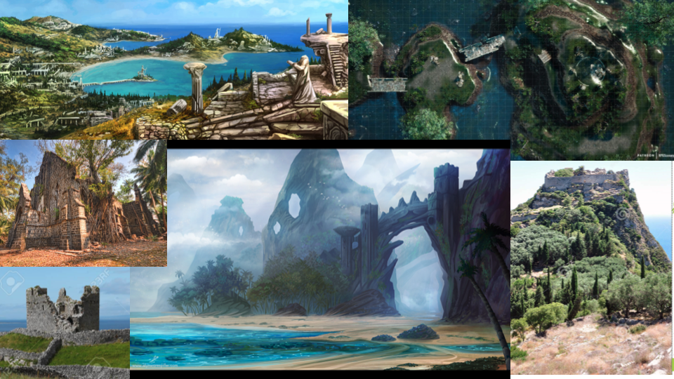
Moodboards:
Research
Daruma:
When we were thinking about a game based on the principle of "red light - green light", we came across the movie "As The Gods Will" and the Daruma that appears in it, so we decided to use small Darumas as runners and a big Daruma in the middle as a Seeker character.
"A Daruma doll (Japanese: 達磨, Hepburn: daruma) is a hollow, round, Japanese traditional doll modeled after Bodhidharma, the founder of the Zen tradition of Buddhism. These dolls, though typically red and depicting a bearded man (Bodhidharma), vary greatly in color and design depending on region and artist. Though considered a toy by some, Daruma has a design that is rich in symbolism and is regarded more as a talisman of good luck to the Japanese. Daruma dolls are seen as a symbol of perseverance and good luck, making them a popular gift of encouragement. The doll has also been commercialized by many Buddhist temples to use alongside the setting of goals." (Wikipedia: https://en.wikipedia.org/wiki/Daruma_doll)
As The Gods Will - game of Daruma-san ga koronda (Dub) - (Warning: Might contain disturbing visual material for some)
Game Pillars - "How pillars and triangles can focus your game design"
Why to Use Game Pillars
"The iron triangle revolves around the practical realities of making a game, while game pillars cover the creative side, but both relate to the importance of focus
[...]
A game’s pillars are a list of around three ‘core statements’ created early in that game’s development. You could come up with your pillars before you’ve started development to help narrow down the possible game you might make, or you might do this after prototyping has given you an idea you want to pursue. You can even retroactively create pillars to help rescue a game that’s been in development for a while and has lost its way.
- Each statement should be short – no more than a sentence – and each should be phrased as a rule you will follow throughout development.
- Use active language. We will, we like, this game is, our audience wants, and so on. Don’t use negative language if you can rephrase the same statement as a positive.
- Importantly, make your pillars focus on how your players will feel over the things they will do.
[...]
[P]illars should focus on the feelings and emotions you want your game to evoke, rather than how you’re going to do it.
[...]
Pillars are the why of your game, and the actual development process is coming up with the what to match those initial goals.
Print your chosen pillars as large as you can and put them up somewhere you’ll see them every day. That way they’ll become ingrained in your thoughts and you’ll easily be able to refer to them when someone suggests a new feature or change to the game. Will that change help bring your game closer to your pillars (great), not really affect them (neutral), or work against them (bad)?
[...]
Your pillars will help guide the eventual game’s details, but they’re a tool for staying on track as you forge ahead, not for coming up with ideas in the first place."
(Raspberry Pi: https://www.raspberrypi.com/news/how-pillars-and-triangles-can-focus-your-game-design/)
Establishing Game Pillars
"ONE: If the entire team is involved, then you run brainstorming sessions where everyone’s potential pillar ideas are stuck up on a wall. Then the group chooses the best pillars or combines a couple of ideas into pillars.
[...]
The advantage of this approach is that everyone understands and buys into the chosen pillars because they had a say in creating them. The downside is that this process can take time, with potentially conflicting ideas needing to be whittled down until an agreement is reached.
TWO: The other approach is for ‘creative vision holders’ to come up with the game’s pillars and then present them to the rest of the team. Obviously, this is much less collaborative and more about saying, ‘I have a vision for this game which I think could be incredible, will you help me make it?’ The advantage of this is that everyone can rally behind a singular vision that someone is passionate about bringing to the world. As a result, the game’s pillars are likely to be extremely focused and all pointing in the same direction. The downside is that it requires everyone else to get on board with the game’s pillars even though they didn’t help come up with them."
(Raspberry Pi: https://www.raspberrypi.com/news/how-pillars-and-triangles-can-focus-your-game-design/)
The Value of Game Pillars
"At the start of a project, they help avoid the ‘blank page’ problem of being able to make anything you can imagine, and later they help you say ‘this, but not that’ and avoid wandering in the development wilderness. So however you choose to structure or word your game pillars, I wholeheartedly recommend spending a little time thinking about the why before you launch into the what.
[...]
[C]hoosing your game’s pillars helps you focus on what’s important
[...]
[N]ot deciding on a game’s pillars can lead to the end result being a mess of conflicting ideas pulling in multiple directions"
(Raspberry Pi: https://www.raspberrypi.com/news/how-pillars-and-triangles-can-focus-your-game-design/)
Keeping Your Players Engaged - Tips for Great Game Level Design
"Plan out Your Levels
[...]
Lead the Player
[...]
Vary the Scenery
[...]
Reward the Player
[...]
Test the Level
[...]"
(PLURALSIGHT: https://www.pluralsight.com/blog/film-games/keeping-players-engaged-tips-great-game-level-design)
Paper Prototype
What we want to test:
Does the core principals and mechanics work?
Format:
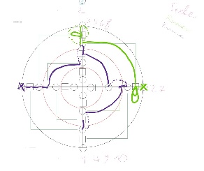
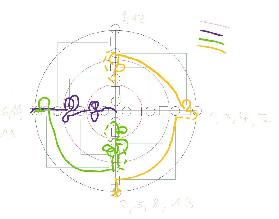
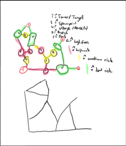
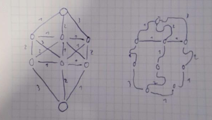
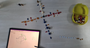
To test our basic idea, we transferred it to an analog board game. IMPORTANT: At the time of the paper prototype, we did not have the idea of collecting coins, instead several runners try to reach the position of the seeker in the middle of the map. The runners start on the outside of the branches and have to try to avoid being seen by the seeker, as this would throw them back two positions again. To avoid being seen, there are spaces where the seeker cannot see the runners (the squares on the digital version & the pathways on the physical version) and areas where the runners can be seen (the circles on the digital version & the villages on the physical version). This is similar to objects and open spaces on the map later in the video game. The coins, which get flipped, indicate how many turns have already been played and thus simulates the game's timer, by which expiration the runners must have reached the position of the seeker in order to win. A turn consists of a seeker-round, where the seeker chooses a direction, he/she wants to look for runners and a runner-turn, where they move forward, change branch at a fork/shortcut, or decide to stay at a position. While the runners digitally draw their position and where they are going on the tablet, the seeker has a physical image of the map in front of him/her, where he/she determines which direction he/she is looking and can illustrate for himself/herself his/her findings by setting markers. At the beginning of a game, the runners first decide where on the circle they want to start. After that the seeker chooses a direction in which he/she wants to look. If there is someone on free space, this runner is frozen and thrown back two fields (not in the first round). After that, it's the runners' turn again and they decide whether they want to stay at that spot, take a step forward or take a turn. After that, it's the seeker's turn again and he/she decides which direction to look in, again exposing runners on free space and putting them back. Now, runners and seeker take turns until the maximum number of rounds is reached (a round consists of runners and seeker action) - the seeker wins - or one of the runners has reached the seeker's position - the runner wins.
Findings & Results:
Round I (one seeker against two runners):
Reset process after a runner was spotted: After a runner is found on this map and is moved back two spaces, he/she is still on a place that can be seen by the seeker. Therefore, it must be prevented that the seeker can immediately see the runner at this open spot again and thus resets him/her. In the paper prototype, this problem was solved by allowing the runner to move into a field in the following runner-round and not letting the seeker know into which adjacent field the runner has moved (unless he has moved back into an open field, which is currently seen by the seeker. Such a case does not exist on our tested map, since there are never two visible fields next to each other). In the later video game, this problem can be solved by a downtime that has to expire before the seeker can mark a runner as found again. Another strategy would be to leave the problem unsolved, i.e. the seeker can reset a runner as many times as he likes. This way, he can take a runner out of the game, but focus less on the remaining runners. However, in order not to allow a runner to have no fun in one round now, because he is stuck by the seeker all the time, a game can consist of several rounds, in which the roles swap. Also, the overall winner of the game can be determined by points. The seeker gets points if his position is not climbed by anyone. In the same way, a runner also gets points if he manages to do so. Now it is not worthwhile for the seeker to nail a player the whole round, if this player is not in front of him in the overall ranking. This could also be extended so that the runners get points depending on whether they have reached the goal, how many times they have been seen or after how much time they have climbed to the position of the seeker. In the final game, the reset problem was reseolved by the runner loosing all currently carried coins to the seeker and getting reset to a random spawnpoint of the map. The Seeker, on the other hand, cannot immediately find the runner he just discovered again, because his viewcone goes dark for 2 seconds and the runner spawns at a random spawn point.
Where should a detected runner be reset to? For the paper prototype, we decided to set the runner back two fields. This would be closest to the later situation in the video game. There, the detected runner should only become immobile, i.e. freeze, and thus roll down the slope he/she is on until he/she can move again. Another idea for later implementation in the game would be a reset to a fixed point or a fixed distance starting from the current point, where the runner was detected by the seeker, similar as done in the paper prototype. The reset-aspect could also be implemented as a random place to reset to. However, as the paper prototype revealed, this would be without other hints too hard for the seeker, as he/she would no longer have any clues where the spotted runner now might be. In the final game, we decided to respawn detected runners at randomly selected, but predefined spawnpoints.These points are mainly located in the back of the main districts.
Balancing of the time the runners have to reach the place of the seeker: During the testing, it became apparent that it should take different amounts of time for the seeker to win depending on the number of runners, since with two runners it is easier for the seeker to prevent them from reaching his/her position than with four or more runners. In the paper prototype, a balancing was done by playing fewer turns, in which they have time to climb the position of the seeker, when there are more runners. In the video game, this can be balanced by the timer that adjusts according to the number of players. However, this timer balancing was not implemented in the programmed prototype, as the prototype was mainly used at events with changing audiences. Therefore, it was important to have a short round time to give as many interested people as possible the opportunity to try out the game.
Round II (one seeker against three runners & the player who played the seeker before, is now a runner):
Both roles (runner & seeker) make fun to play: We changed the player roles. The one who played the seeker in the first round, was in the second round a runner and one of the runners was in the second round the seeker.
Both roles (runner & seeker) seem balanced: In the first round, no runner got to the point of the seeker, so the seeker won (what can be seen in the second picture in section "Format"), and in the second round a runner reached the position of the seeker, so this runner won (what can be seen in the third picture in section "Format").
Paper prototype is playable without additional featueres: As picture two and three in section "Format" show, we considered in advance that in the paper prototype, the seeker is told when a runner crosses one of the circles drawn on the map (see second or third picture in section "Format"). This gives the seeker another clue where the runners might be. However, during testing it turned out that a balanced and interesting game is possible even without this additional feature.
Runner can see that he/she has lost before the round is over: In the paper prototype, the lap indicator (the coins) shows a runner before the end of the game when he/she no longer has the number of turns he/she would need to complete the remaining distance to the center to reach the seeker. This leads to the game becoming boring for this runner before the game is over. However, this should not be a problem in the video game, because in contrast to the paper prototype, the runner does not have a global overview of how far it is to the seeker because of the third person view. Furthermore, in the video game, the map is not divided into squares (discrete), where the runner moves only one per turn, but the world is a continuous area.
General Notes/Findings/Questions:
Where can runners start? & Can runners start together on the same spot?: Due to the circular and symmetrical map and the maximum of three runners, we decided that the runners are free to choose their starting position from the four outermost squares as their first move (the "x"s in the second or third picutre in section "Format"). Several runners are also allowed to start and stand on one field, since this would not influence the gameplay because of the many forks, where the runners can decide where to go and since they can stay in a square for multiple rounds, which leads to the fact that during the game the runners spread all over the map no matter where they have started.
What happens when a runner is seen by the seeker in the first round?: Since on our tested map all outermose squares are visible squares, there is a possibility that runners will be seen by the seeker directly after they have selected their starting points. This does not put the discovered runners even further back, they are already on the outside of the map, but only results in the advantage for the seeker that he/she knows where the detected runners start. The runners can then advance to the next square normally in their next turn.
- When exactly is a runner spotted by the seeker?: In general, a runner can be spotted by the seeker if the runner is on a visible square in the seeker's turn and the seeker is looking in the runner's direction. If a runner has been spotted and resetted, the seeker will not be able to tell which square the runner is moving to on his next turn. If the seeker could see where the runner is moving to, this would be too much of an advantage for the seeker, since he/she would know another step of the runner and could thus greatly narrow down the next possibilities where the runner could be. If a runner moves in his/her turn from a hidden square to an open one that the seeker observes at the moment, the runner is spotted and resetted. This feels natural, since the runner is running into the view cone of the seeker. In addition, the tactic that the runner observes the same area for several turns, since he suspects a runner there, gets more meaning this way.
External Playtester Feedback:
The game idea has potential
The core principals and mechanics work
- Concerns: Is the idea and learnings from the paper prototype transferable to the real time video game with a continuous map?
Gameplay Prototype
Core Gameplay
Character Controller Runner:
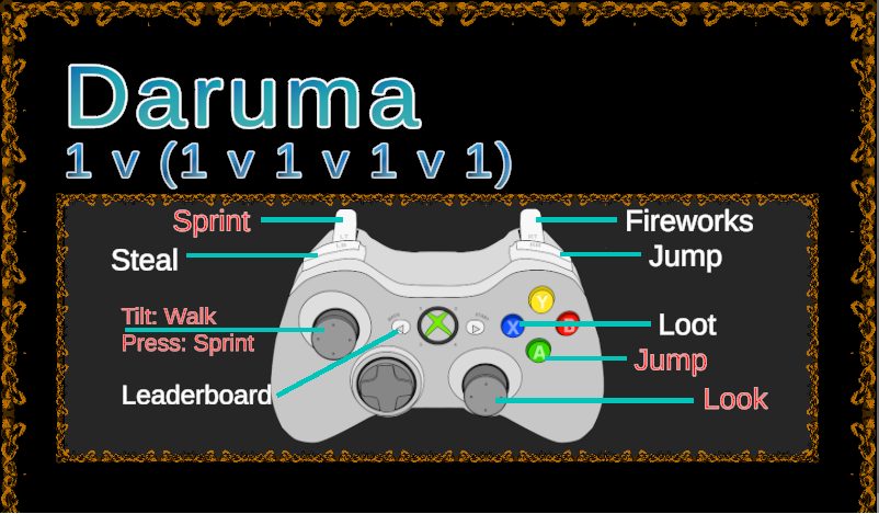
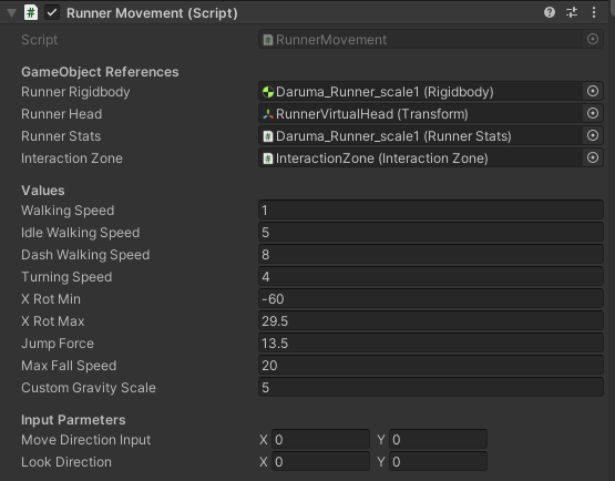
The first iteration of the runner controller was a 3rd person controller, equipped with a freely rotation camera, as well as the abilities to jump, dash, and place fireworks. After the first playtest, the jump was significantly changed with custom pyhsics to be less floaty and be more responsive, which lead to some jumping section adjustments. Also, a steal mechanic was added to encourage more Runner vs. Runner combat. Furthermore, the dash mechanic was changed to a sprint mechanic with a stamina bar. The final stats of the character controller, which are the result of our testing an playtesting, can be seen in the following picture:
Character Controller Seeker:
The first iteration of runner controller had two different control types. The first one was to have the view cone fixed in the middle of the screen, while the mouse movement was translated into seeker rotation. The second one was free mouse movement within the screen, while the keys A, S, D, W were responsible for the seeker rotation. The second version later became the final verison. Furthermore, on left mouse click, the view cone is deactivated and if a runner was inside, they are caught and lose their coins.
Getting Spotted Mechanic:
Each runner has multiple sensors that "can be seen". Each sensor shoots a ray towards the seeker, checking if it reaches the seeker itself, or if it is blocked by another collider. When one of those sensor enters the collider of the view cone, it is activated. If a sensor is activated and the ray hits the seeker without any collision in between, the sensor is "visible" to the seeker. If one of the sensors is "visible" and the seeker presses the left mouse button, the runner is being spotted.
Gym Scene
What we want to test:
Runner:
Jump height
Jump distance
Dash distance
Running speed
Camera distance
Map:
Slopes & Stairs
Cover height
Cover width
Tunnels
Window height
Documentation of the Metrics
Level Prototype
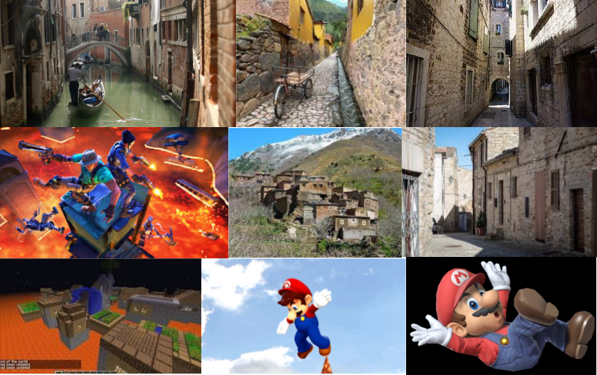
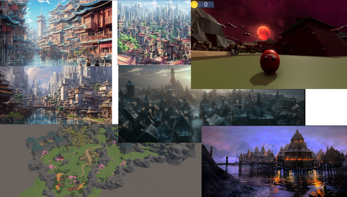
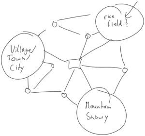
First Map Ideas
Art Styles - Different Ideas
City Blocks & Streets & Trains
Enterable Buildings
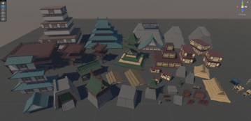
Final: Low Poly - Grass, Water, Stone, Japanese City, Daruma
Multible Level Prototype Iteration
Steps to the Final Level
Smaller Map
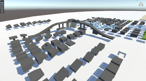
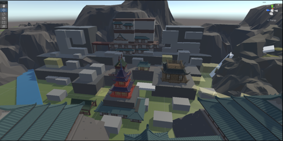
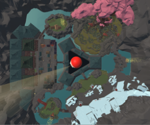
As can be seen in the picture below, the map is too large to recognize the small runner in the back (small dot in the back of the map). Additionaly, there exist the problem that the seeker sees everything always. To determine the correct height of the Seeker's point of view, we experimented with different tower heights what can be seen in the center in the picture below.
Paths & Timing
Also the paths, that runners might traverse, are too long. This is again an indication that the map is too large.Lots of Redesign
Duing the development and iterations of our map, we had to do lots of redesign and rethinking. In a next step, we make the map smaller and redesign it around the seeker, who is now located in the middle.Distinctive Areas
We decided on three main districts with entrances to the castle and three connecting side areas, which contain the highest loot. Furthermore, all districts are shaped through different assets and also support different gameplay.
- Seeker in the middle
- Design map around
seeker - Gives seeker clear hints in which areas runners could be
- Allows to balance areas
Each area with own feeling, looks with minimal overlap, non-reachable space in between
- Forrest - Jump'n Run; Mountains - Sprinting; City - Sneaking; Pillars, Lake Village - richest so Risk vs Reward
Pictures of the first iteration of districts:
Circular Design
In the end we decided for a circular design of our map.
Coin System
- Single Coins that are spread all over the districts and can be collected by running into them (also helpful as cointrails to guide runners and to indicate paths)
- Later: powercoinhubs in sideareas that can be looted pressing "x"-button on the controller for five seconds and drop 25-30 coins
- Coinhubs and powercoinhubs assets: first colored spheres, later statues, temples and marketplace with particle effects if currently lootable
- All coins and hubs are respawning during one round
- Make map traversal necessary
- Chance to balance map
- Give seeker hints where a runner may have been, since the spots are looted (no particle effects anymore)
Final Level
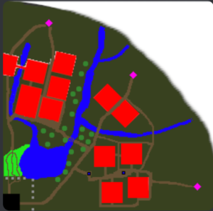
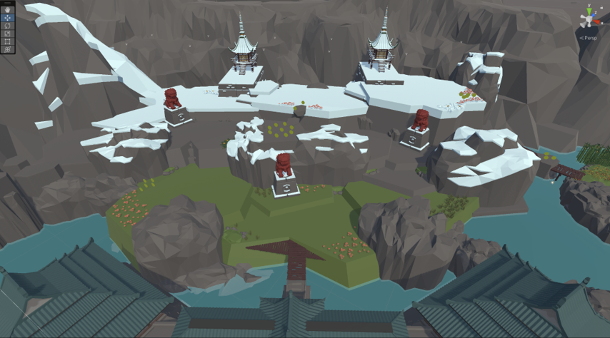
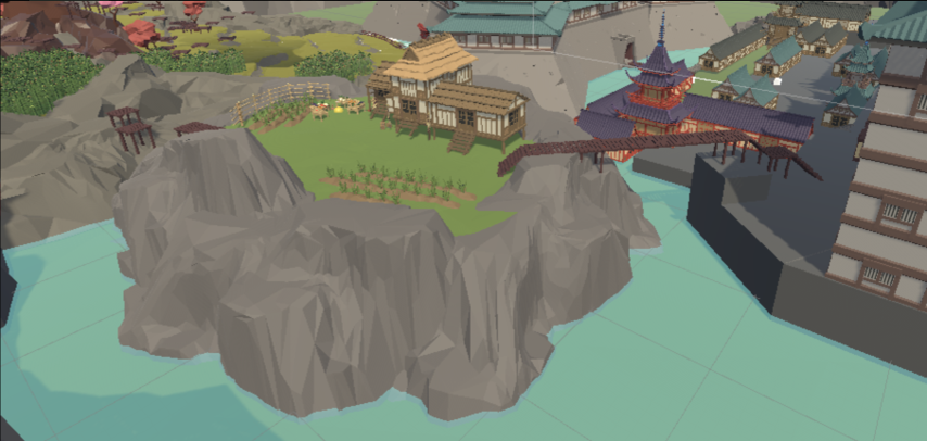
In the following pictures, the final state of the map is shown.
Playtest - Christmas: Family & Friends (Early Stage)
During the christmas break, we had our first playtest with our families and friends. The basic gameloop was working at this point, but the map was still in its early stages, as we were using our first level prototypes. Even though we only had limited users and an early verison of the map, there were already things that became apparent through the christmas playtest:
- Main idea is very fun - This was especially interesting, because the game was clearly still a prototype, yet everyone playing was already enjoying themselves
- 3 player requirement - A fact that we didn't think about before. The game needs at least 3 players to work (instead of what we thought would be 2), because once the runner is in the lead, there is no reason for them to risk getting caught, so they can just hide until time runs out
- Map needs iteration - Biggest weakness of the game at this point, there were several issues that we encountered:
Everyone can go everywhere - Everything is accessible by the runner, even areas that are not supposed to be walked on, which makes the readability of the map rather poor
No hints for seeker where to look - Connected to the point above, but not restricted to it. Since the runner can go anywhere, and there are no clear sports for coins and coin hubs, the seeker is just randomly looking around in hopes of finding someone
General map/area balance - The areas in the map were unbalanced, some were super strong for the runner, some for the seeker. Furthermore, they all felt the same when it comes to gameplay, which was "rush towards middle after finding a coin or two.
Playtest - Pizza Play Test (Medium Stage)
To prepare for our next playtest opportunity, the pizza playtest hosted by Irox Games shortly after the christmas break, we concentrated on creating our first actual level instead of using our level prototypes for it. The general direction of the feedback was pretty similar to the christmas playtest:
- Map readability still not optimal - Even though the map readability became better compared to the christmas version, it was still lacking in some areas
- No tangential traversal of map - This is not something that people told us, but what we observed. There is almost no tangential traversal of the map, making the side areas more or less obsolete
- Map pretty unbalanced - Some areas were still pretty unbalanced, but it was progressing in the right direction
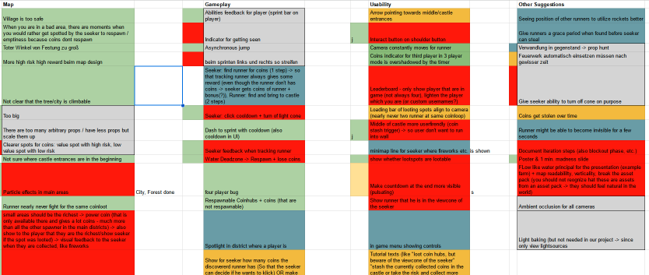
However, we managed to get way more feedback based on the number of playtesters we had during the pizza playtest. This feedback was gathered and categorized into four different big categories:
- Map: Everything related to level desing and level engineering
- Gameplay: Everything related directly to gameplay, like feels of the runner controller, or improvements to the UI
- Usability: Things that are working fine, but should be polished, like bugs or button placement
- Other suggestions: A list of concrete ideas of playtesters of what feature or mechanic could be added to the game
Each categorized feedback was then given a priority, because implementing all of it would not have been possible time-wise considering the deadline.
Play Sessions - Demo Day / GGBavaria (Final Stage)
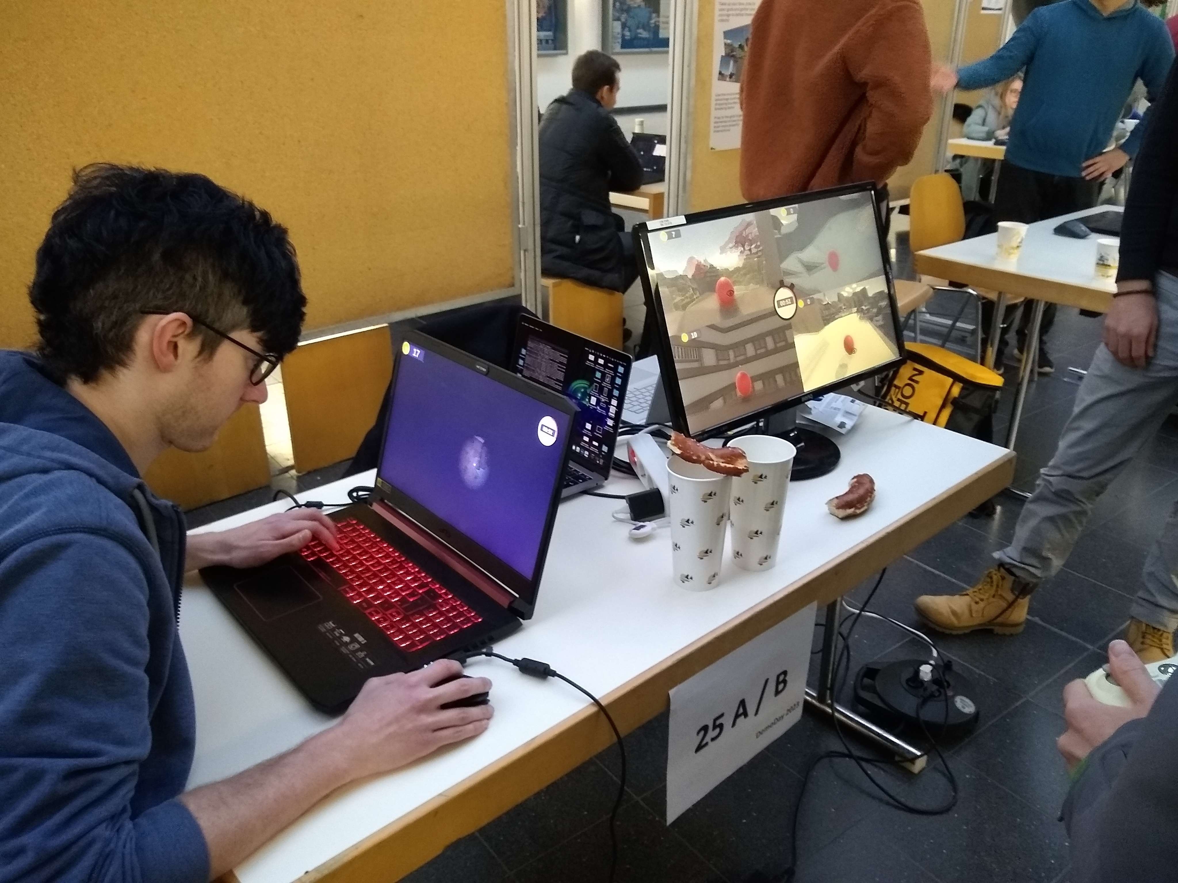
The final version of the game was showcased on TUM's Demo Day, as well as GG Bavaria.The reception was overwhelmingly positive. Especially at the GG Bavaria, where the game was displayed in the middle of full-time indie game studios, we got comments like "Where and when can I buy it? I need it!" or "This is the best game among all games displayed here!". Of course, since this is a student project, and was not meant to be commercial, we provided a link to everyone interested where they could download it for free.
Final Results
Applied Level Design Concepts
Among other level design concepts applied and learned during the course, the following concepts are the ones that probably stand out the most to us:
- High Risk/High Reward vs. Low Risk/Low Reward - In our game, the smaller side areas are very risky, but also offer a lot of loot. This made the game way more dynamic, since it now supports multiple different playstyles. One can just gather a few coins and immediately stash them in the seeker castle, or one can take the tangential long route, but be rewarded with way more coins. Both playstyles seem pretty balanced and viable.
- Map Readability - To increase map readability, we applied many smaller concepts:
- Reduce asset variety: By reducing asset variety and sticking to a select few assets per area (e.g. 1-2 type of flowers instead of 5+ types), it became less random and it allowed us to make the different areas more distinct
- Patches: Instead of placing assets randomly across the level to fill the space, create patches of assets. Those patches guide the player through the map more effectively with clear edges between for example a path and a patch of flowers
- Landmarks: Place distinct landmarks across the map, that can ideally be seen from many different angles and positions. Those can guide the player into the right direction for medium to long travel distances. Those landmarks were often connected to coin hubs or lootable, which simultaneously helps the seeker, since now he or she can narrow down the possible positions by probability
- Coin hubs: Similar to patches, instead of placing coins seemingly random and one at a time, place coin hubs, which has a combined effekt of patches and landmarks from above
- Map Beauty - To increase the looks of the level, we applied many smaller concepts as well:
- Increase asset variability: Since we reduced asset variety, we now have to avoid making the level look like assets have just been copy-pasted around. This can be achieved by increasing asset variability, meaning that every time an asset is duplicated, it should also be rotated and potentially scaled, depending on the scenario
- Stairways: Stairways can look boring and feel too long pretty fast. To avoid these issues, we added landings and scaled the size of the stairways to make them way broader (e.g. instead of ~2 character sizes, use ~5 character sizes). This has the added bonus that no one can really fall off the stairs, which is usually something you want, unless it is specifically designed to be fallen off of.
- Form variety: A general way to make things look less boring is to increase the form variety. This is similar to already mentioned points above, but a bit different as well. Form variety can be achieved by slightly altering an existing construct of connected assets. For example, a simple, straight bridge can be made more interesting by adding an additional (functionally unnecessary) landing in the middle, making it slightly broader, adjusting the height of it by a bit, and rotating the connecting parts of the bridge.
- Asset size: In general, points of interest seem to look better when they are bigger. A general rule of thumb for when something looks kind of boring or not very special, is to scale it by a factor of 2 and look at the result. This typically makes it stand out more so that they don't seem randomly placed, and gives the world a feeling of mightiness
Findings
The main takeaways of the level engineering practical course for our team are the following:
- Simple mechanics > complicated mechanics - Simple mechanics and a simple game loop is completely sufficient to make a fun game
- Level design supports simple idea - A simple game idea gets supported by good level design and clearly enhances the player experience. Important aspects of good level design are: Map readability, high risk high reward structure, asset size, low asset variety, high asset variance
→ Level design makes a good game idea great
Indeed, our game was received way better after reworking the level, without changing any mechanics (pizza playtest vs ggbavaria)
Discussion
Even though we are very happy with our final result, there are still things that can be improved upon:
- Map iteration never ends - There are still some players, even though less common, that struggle to understand where to get coins, where to bring the coins to, and where and how to hide.
- Crucial to throw away old ideas - During our journey, we iterated on the map a few times, and we also had to throw away some old ideas and the work that went into them. Even though this stung in the beginning, we think the end result was worth it, because sometimes an idea just doesn't want to work, no matter what you try, which is when you should move on.
- Networking to bypass hardware requirements - Currently, the game needs 2 screens, 1 keyboard, 1 mouse and at least 2 controllers. This hardware requirement is simply too much for a small "party" game and requires a lot of setup. Therefore, the potential long-term steps to bypass that problem is to implement networking. This also practically decreases the amount of players needed to 1, which is another advantage of networking in this situation.
Brief Overview of the Entire Path of Development
Paper prototype (round based) - Does the core principals and mechanics work? -> Some rules unclear
Maps: Map designing with different potential paths and such
“Blockout” of map → Too flat, too big, still many problems
First circular iteration: Helps with verticality, however, no clear area distinction, still too big
Second circular iteration: Better area distinction, still some problems with readability and size
Final iteration: Water for even clearer area distinction, reduced asset variety, moved things closer together to decrease size further


